Onafriq is a pan-African payments company which enables interoperable cross-border and domestic digital payments in over 40 African countries, covering more than 1300 corridors and managing over 500 million wallets.
Challenge
The system was a legacy UI built over time with no central design system, resulting in a confusing, fragmented interface that was slow to use and difficult to navigate. As the company acquired new teams and systems, the UI became even more outdated and inefficient.
Impact & Constrains
The primary driving force was the pressure from stakeholders to deliver quick wins, which limited the ability to address systemic design debt – but this also created opportunities to show value through small, impactful improvements while aligning with broader strategic goals.
Teams
Worked cross-functionally with the Head of Product, Project Managers, BE/FE developers (on both the client and studio sides), and other UX team members.
My role
UX Designer, involved in end-to-end product design from research to implementation.
Timeline
April 2024 – April 2025
Task completion time reduced by
40-60%
Error rate reduced by
30%
Increase in perceived clarity and usability
40%
Assessing UX before the redesign
Interviews and usability testing with 5 internal users on top tasks
Problem statements created out of empathy maps and user stories:
Morgan is an Operations Team Member who needs bulk processing capabilities because managing thousands of individual transactions is time-consuming and error-prone with no multi-select or bulk action tools.
Darius is a Lead Developer who needs improved mobile responsiveness and session management because he needs consistent performance and access to functionality across devices without session expirations or broken UI elements.
Aisha and Leyla are Partner Onboarding Specialists who need automated onboarding and approval processes because manually handling partner accounts and approvals is slow, repetitive, and prone to errors.
All users are B2B support and operations professionals who need scalable, consistent data access across all transaction types and APIs because fragmented and inconsistent data from multiple sources slows decision-making and reduces trust in the system.
4 areas for improvement
1.
Bulk Processing of Data
2.
Mobile-First, Responsive Design
3.
Consistent Data Access
& API Integration
4.
Scalability and Infrastructure Improvements
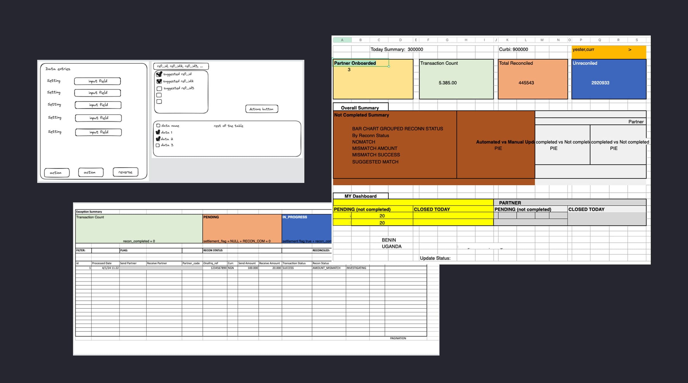
Design Exploration
Design and Brief Artifacts
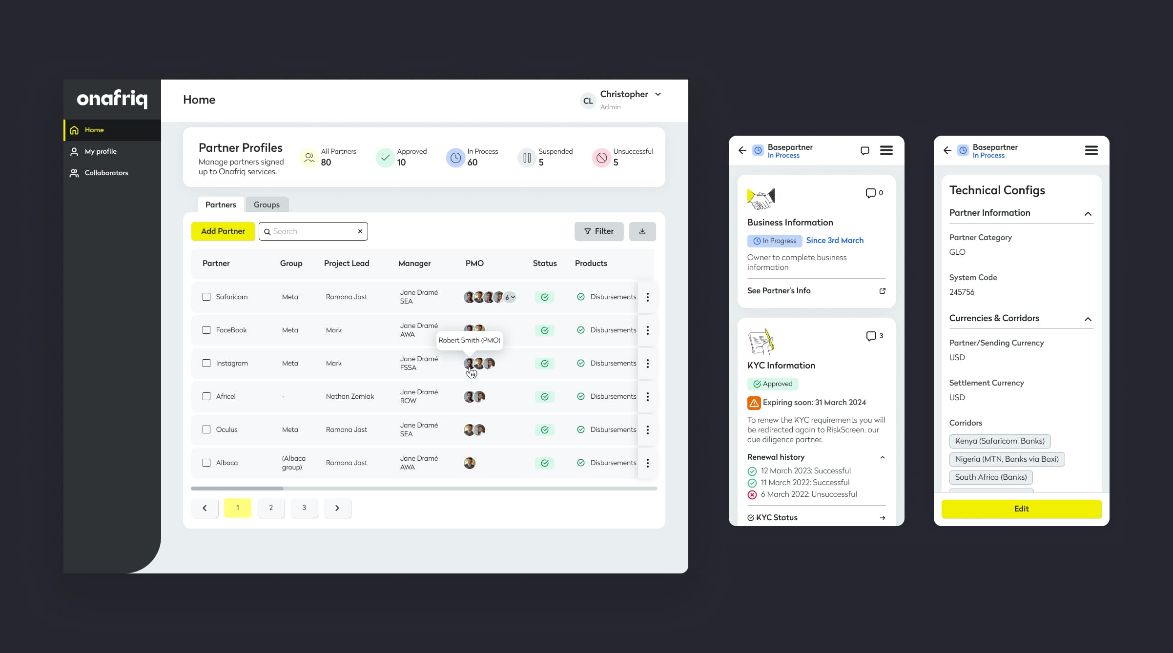
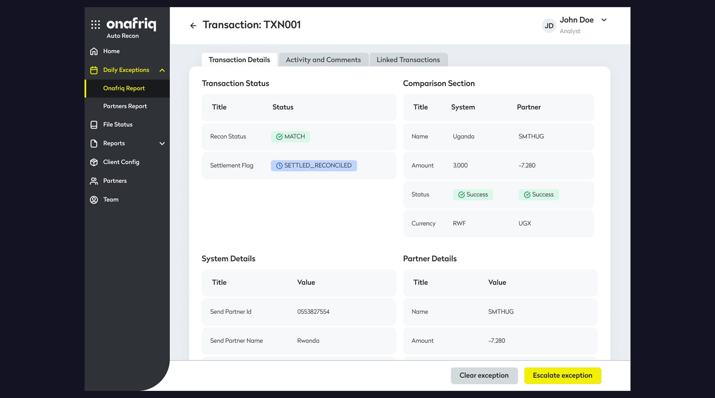
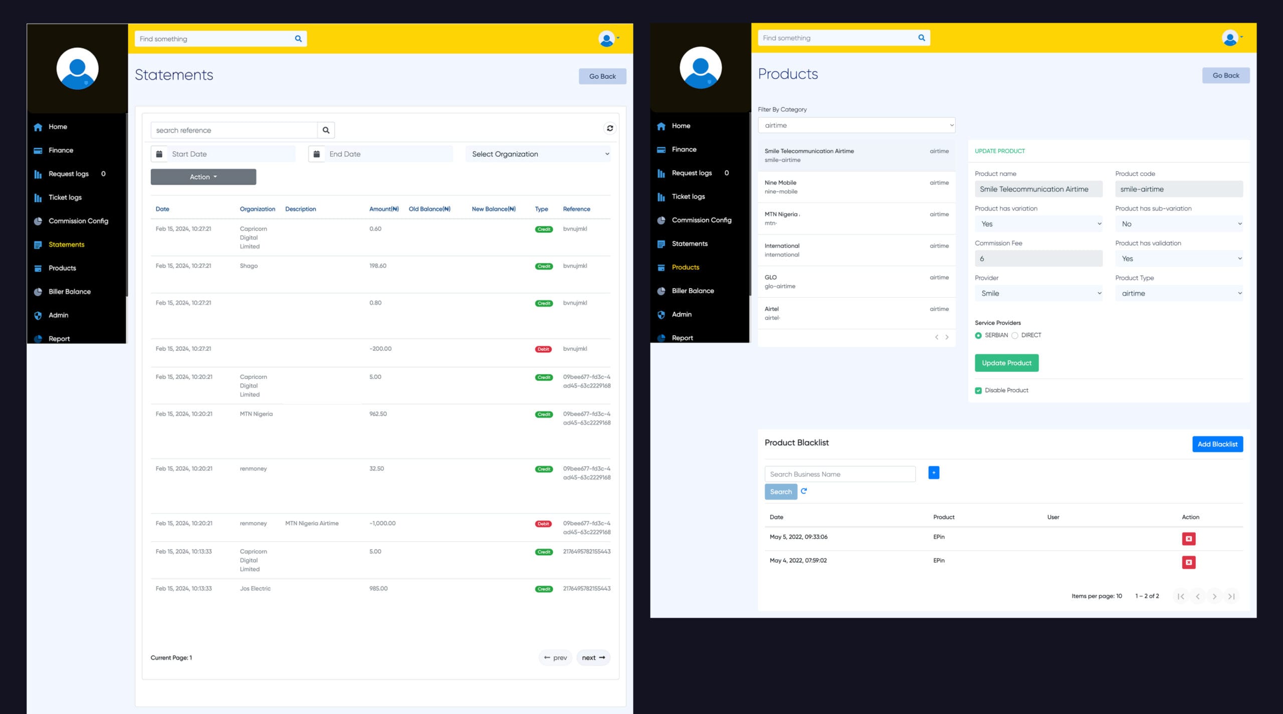
Challenge #1
Every user, from onboarding specialists to transaction managers, is performing the same repetitive tasks manually. This is negatively impacting productivity and increasing risk.
Image is clickable
Design Decision
I’ve created a solution that incorporates similar patterns and structures from previous designs to minimize confusion for internal users regarding new elements, while also reducing and optimizing the amount of manual work and actions needed to complete daily tasks.
Image is clickable
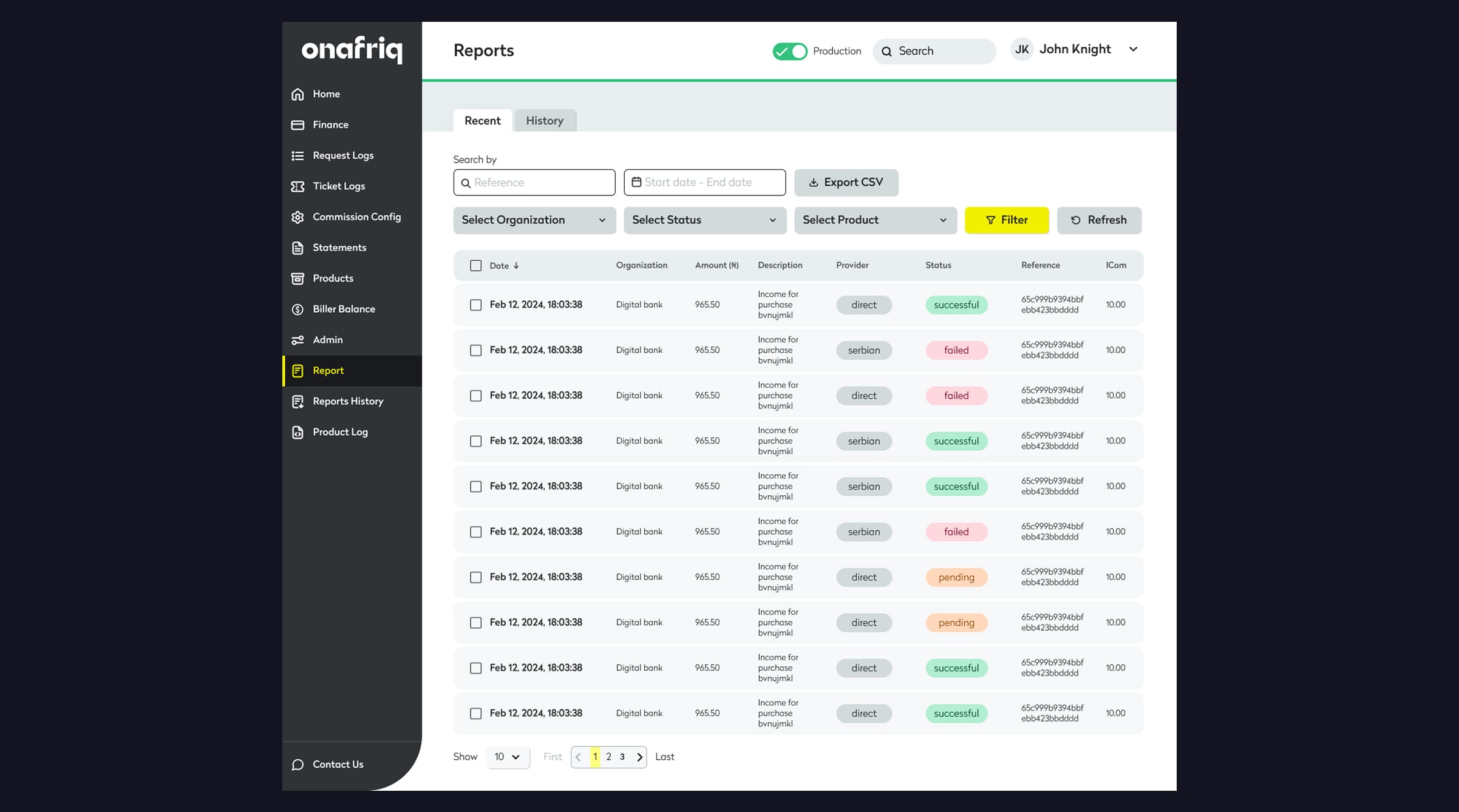
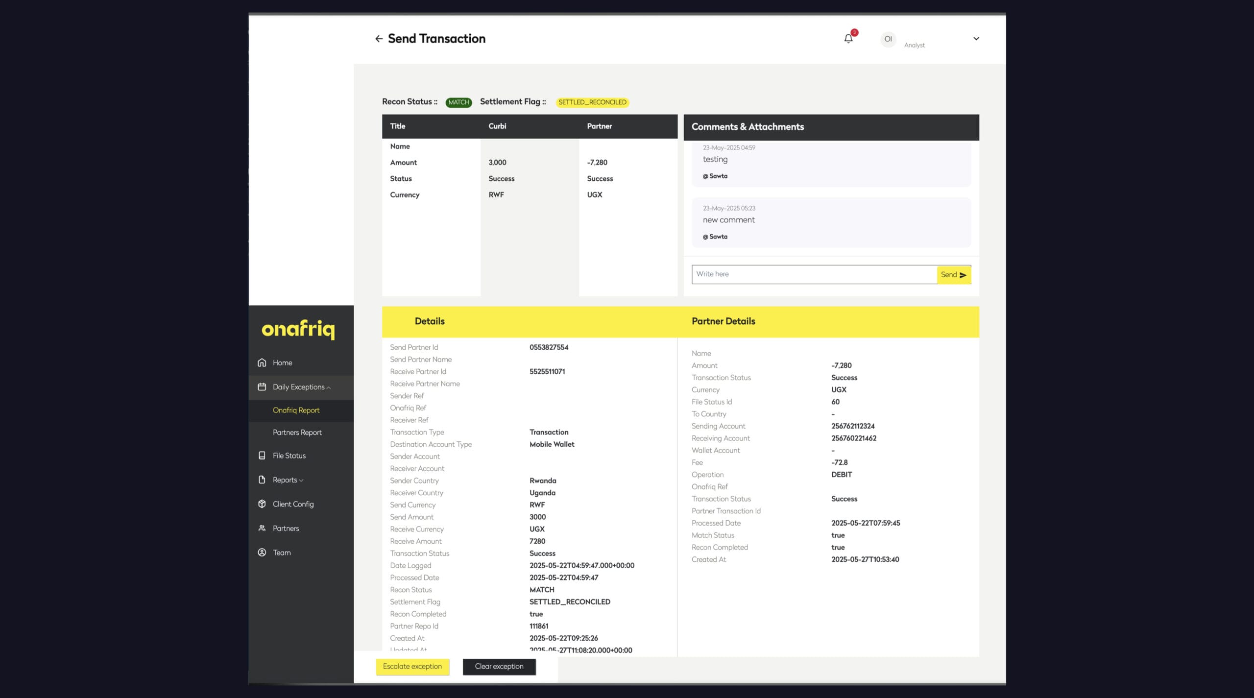
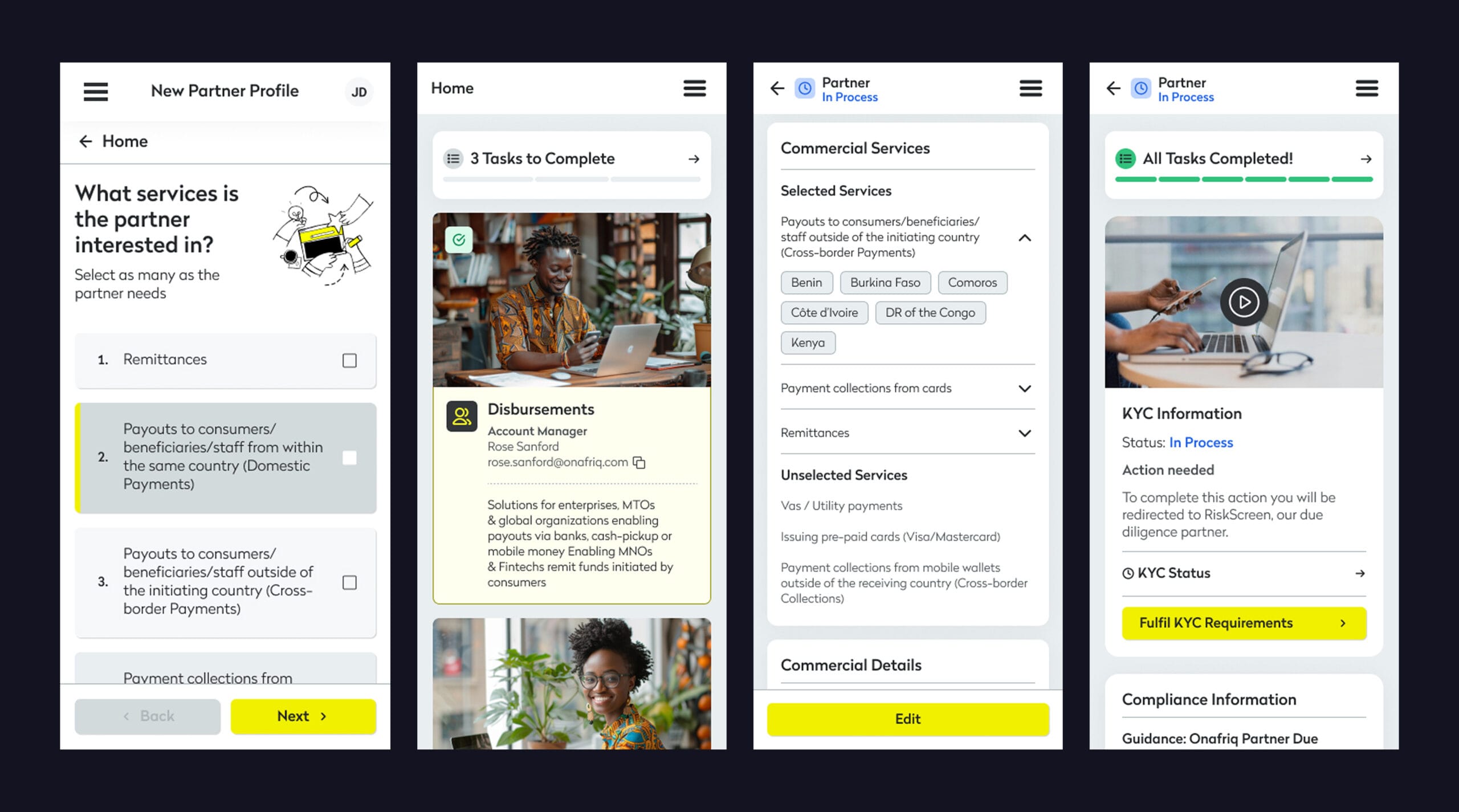
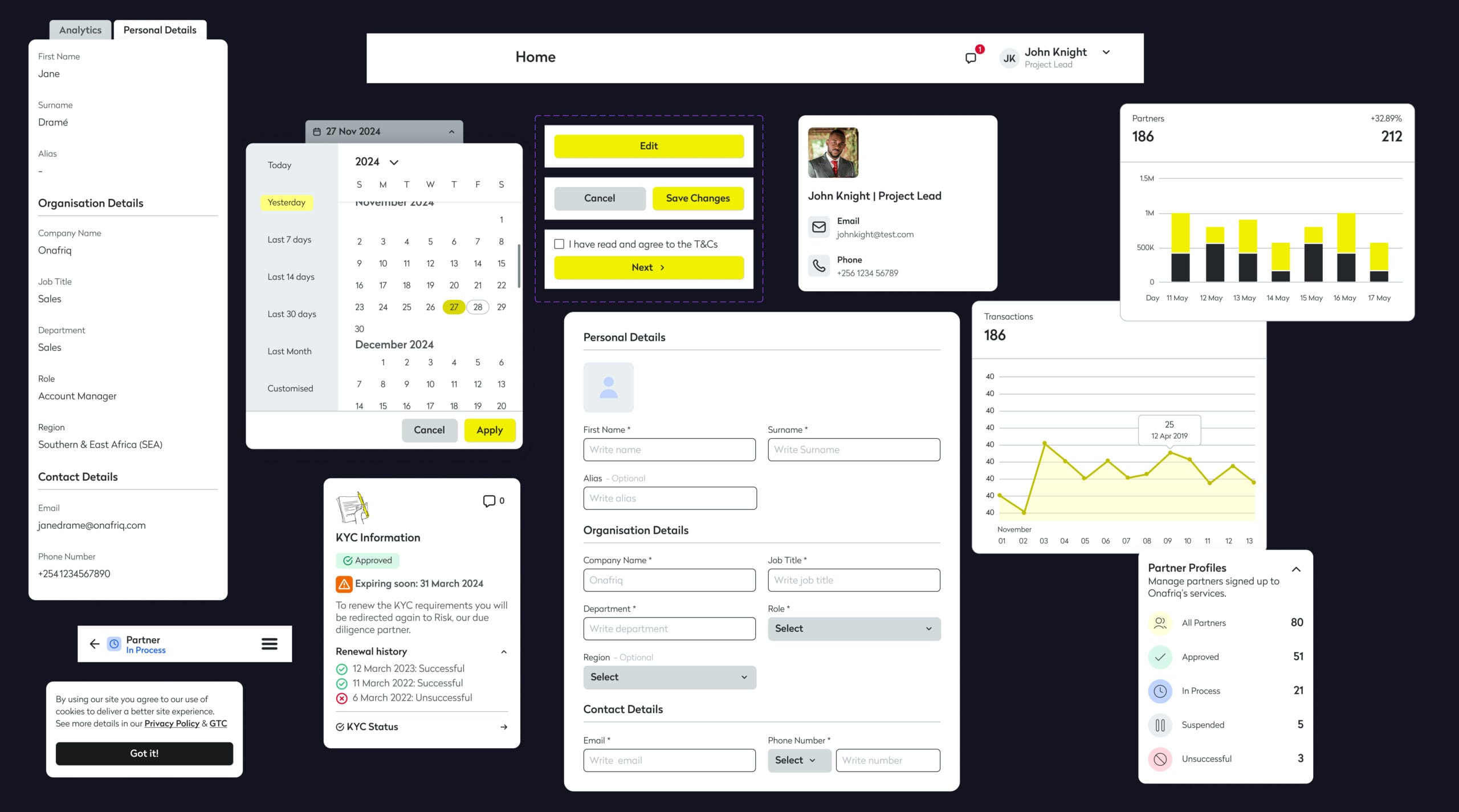
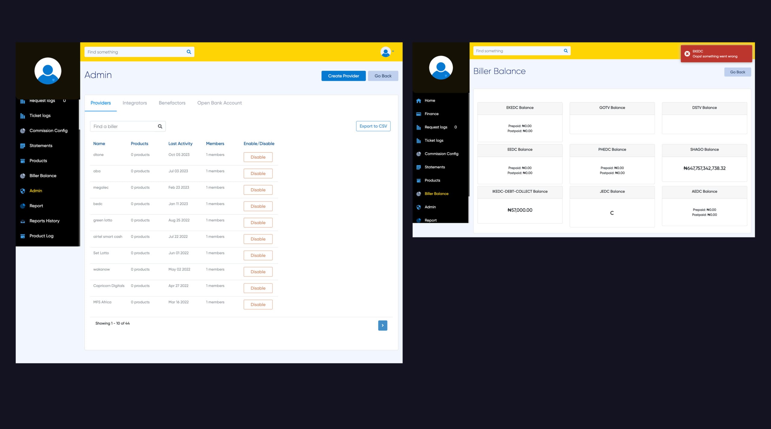
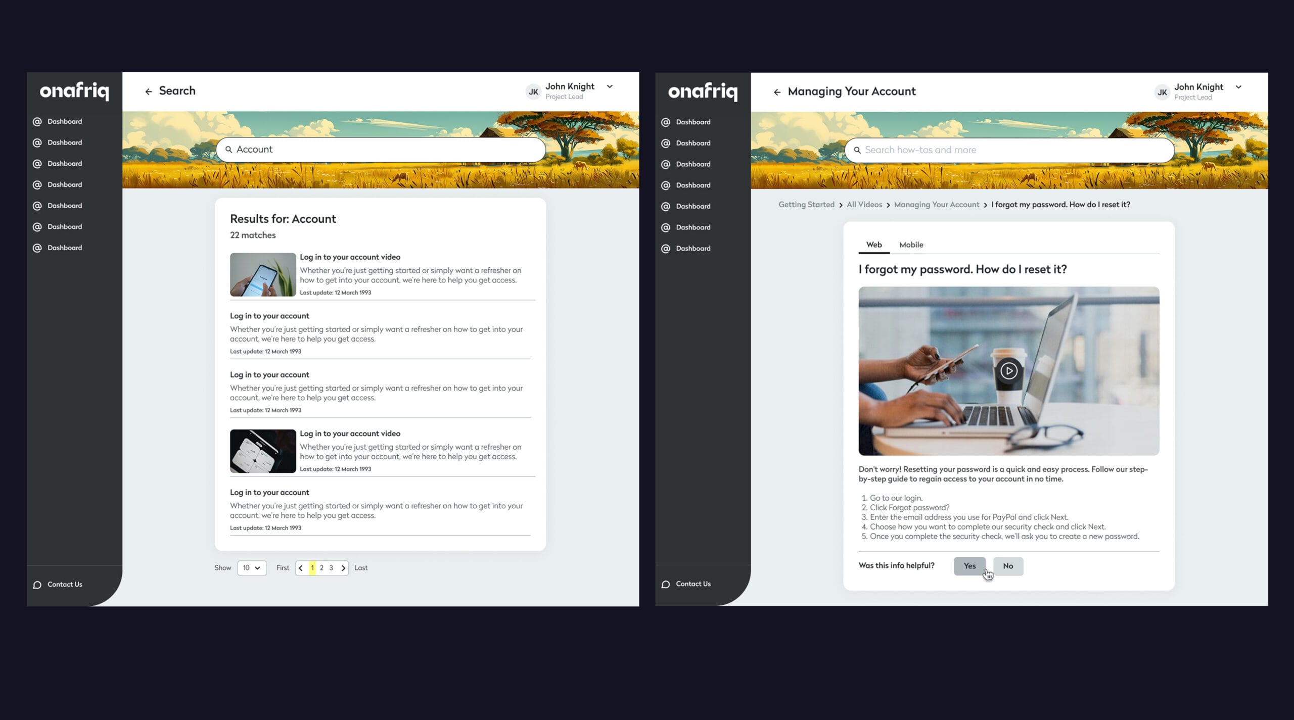
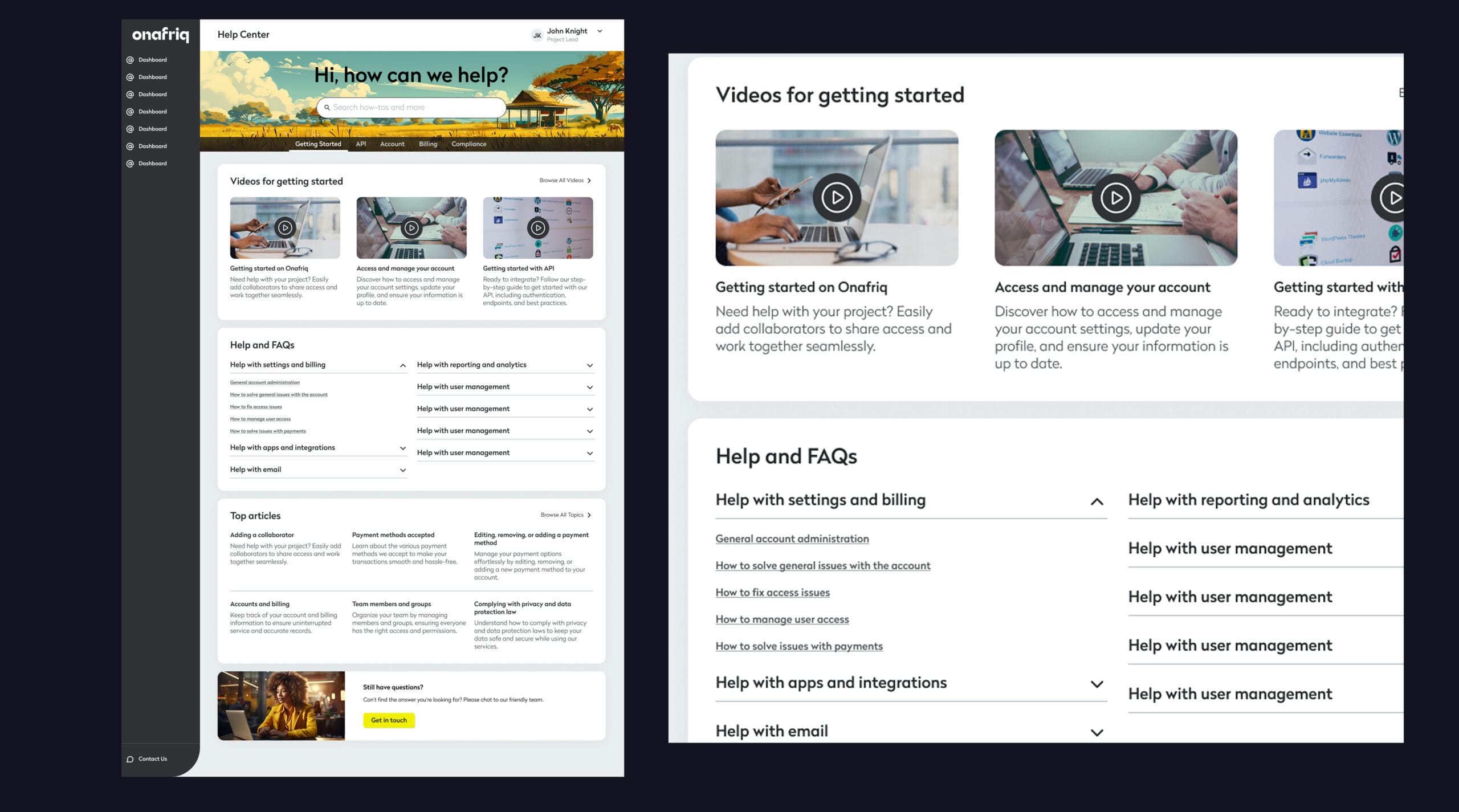
Challenge #2
The user experience is failing under pressure, with a clunky desktop interface and a broken mobile experience, while inconsistent data across APIs creates a fragmented and unreliable view – undermining trust, decision-making, and operational efficiency.
Image is clickable
Design Decision
I’ve prioritized a unified user experience that integrates a consistent design language across both desktop and mobile platforms to simplify navigation and reduce cognitive load. By aligning the interface with existing design patterns, I’ve also minimized confusion for users when interacting with new features.
Error rate reduced by 30% in a specific data-heavy workflow
User satisfaction improved from 4.1/10
to 8.5/10 based on post-implementation feedback
User feedback highlighted a 40% increase in perceived clarity and usability
But UX is never done…
As the project moves on, so here are the things I would love to improve next:
Improve accessibility
I wish I could improve it today – like ensuring better keyboard navigation and screen reader compatibility
Remake the onboarding flow
The current onboarding process feels too long and repetitive. I want to simplify it using micro-interactions and more personalized steps based on user behavior or preferences.
Lesson for myself: Save all of the research artifacts in one place no matter the significance
In order not to make it a pain in the ass when you need to recollect everything, it’s best to keep things organized, documented, and easy to find. Whether it’s notes, files, or important details, having a system in place ensures you can access what you need without frustration or wasted time.