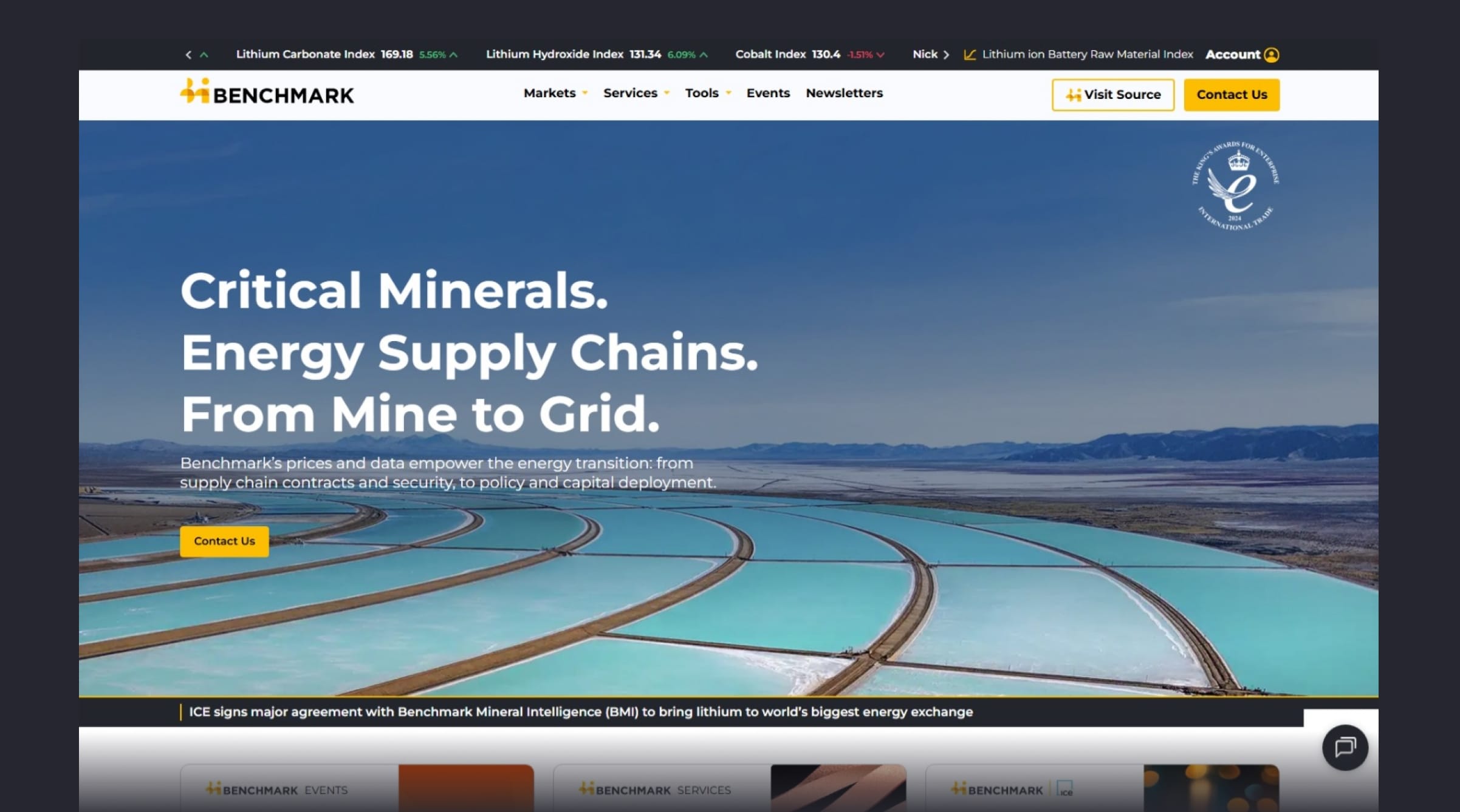
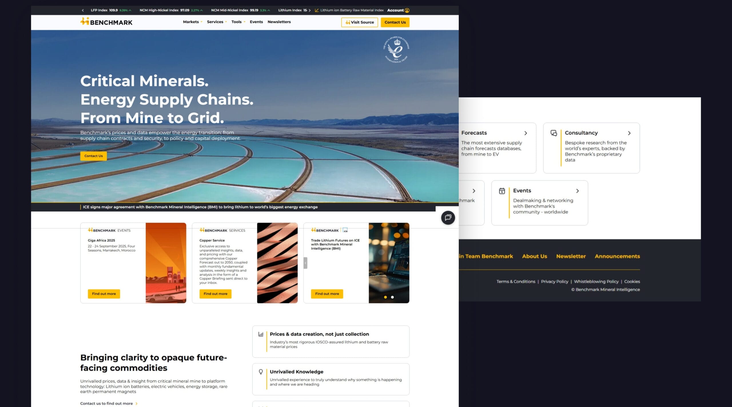
Benchmark Mineral Intelligence is a price reporting agency and specialist information provider of independent, timely, and actionable insights that empower energy industry leaders, governments, and investors to make informed supply chain decisions within the rapidly evolving energy landscape.
Challenge
The project faced significant time constraints, as the need to deliver actionable insights quickly to stakeholders imposed pressure to produce results that could be immediately demonstrated and validated. Additionally, the challenge extended to aligning closely with the lead designer from Benchmark Mineral Intelligence to ensure that the insights presented were not only data-driven but also visually and strategically coherent.
Impact & Constrains
The primary constraint was the tight timeline, which limited the ability to conduct deep-dive exploratory research or develop long-term brand strategy frameworks. However, this also created opportunities to deliver high-impact, stakeholder-focused outputs that addressed immediate pain points and aligned with the broader strategic goals of Benchmark.
Teams
Collaborated closely with the Lead Designer from Benchmark Minerals Intelligence and UX designers from the studio.
My role
UX Designer, responsible for conducting UX research, performing heuristic evaluations, and analyzing funnels to inform design decisions.
Timeline
September 2024
Total usability problems found
117
Critical / Major usability problems
34%
User sessions analysed
>150
Assessing UX before the redesign
Heuristic Evaluation and Funnel Analysis
Problem statements created out of synthesized research data:
Users struggle to discover and access the most relevant forecast data, leading to wasted time and reduced decision-making effectiveness.
Accessibility issues prevent users from fully utilizing the platform’s capabilities.
The overwhelming volume of data presented results in cognitive overload, making it difficult for users to identify key insights and trends.
Supply chain analysts lack the contextual insights necessary to understand the potential impact of forecast data on their operations.
4 areas for improvement
1.
Low Discoverability
2.
Accessibility Issues
3.
Information Overload
4.
Lack of Context
Uncovering Problems
Heuristic Evaluation Artifacts
Challenge #1
Some elements of the interface (e.g., color contrast, font sizes) didn’t meet accessibility standards for users with visual impairments. Modals and elements on the page don’t maintain focus for keyboard navigation, causing issues with accessibility – and users are likely to miss important instructions or fail to process key actions.
Image is clickable
Before redesign
Image is clickable
After redesign
Image is clickable
Challenge #2
Users experience inconsistent keyboard navigation across multiple pages, leading to frustration and difficulty accessing elements when using keyboard-only input methods. Specifically, focus jumps unexpectedly between elements, and keyboard navigation doesn’t always reach interactive components.
Image is clickable
After redesign
Image is clickable
Results
Users can successfully complete key tasks using only the keyboard, demonstrating significantly improved accessibility
15% increase in average user session duration
24% increase in monthly active users of the chart builder feature
But UX is never done…
As the project moves on, so here are the things I would love to improve next:
Improve tooltip copy clarity
I’d like to refine the tooltip copy, ensuring it’s concise, informative, and avoids jargon. A small investment here can dramatically improve learner adoption.
Reduce cognitive load in table views
Tables with excessive columns contribute significantly to mental fatigue. I’d reduce the number of visible columns by default, with an option to expand/collapse based on need. Prioritize critical data.