

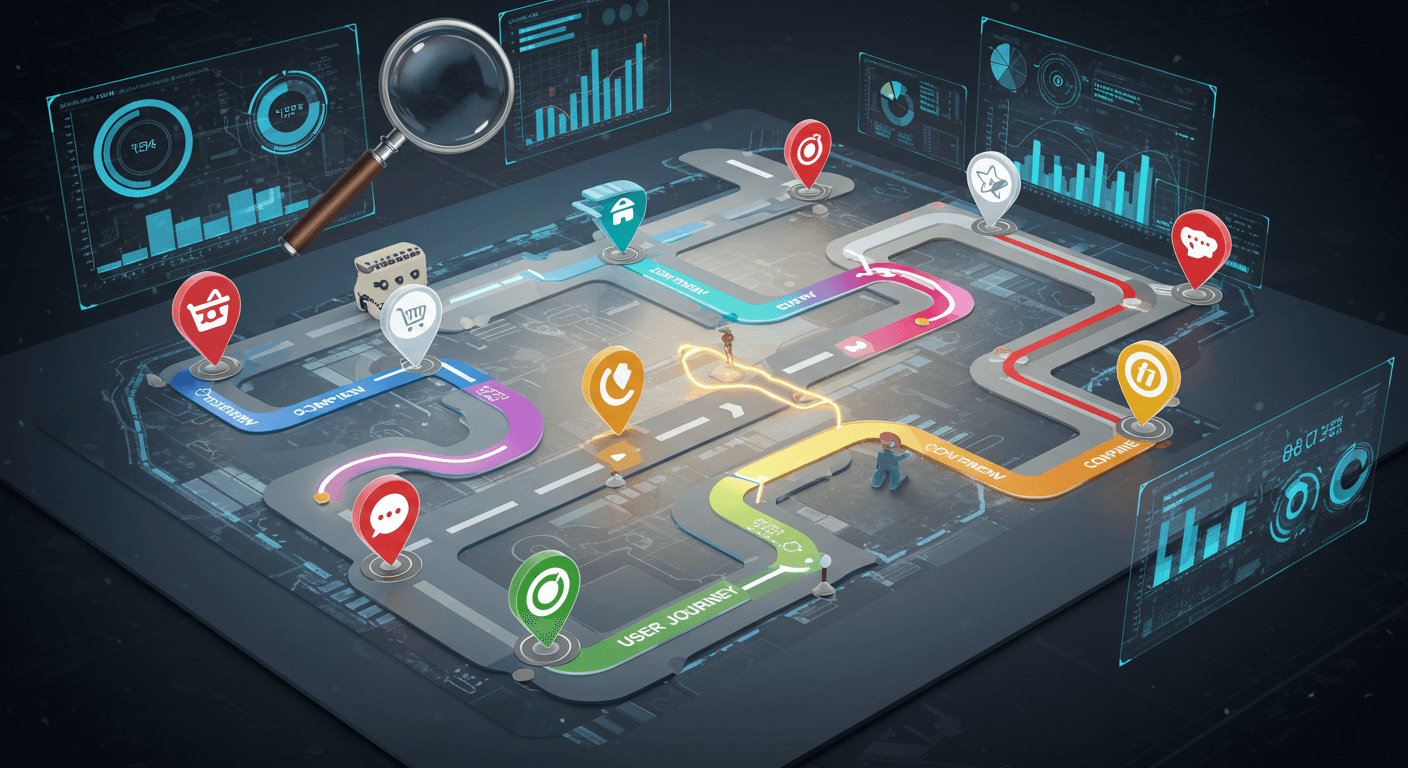
Understanding User Flows
Defining User Flow: A Technical Perspective
A user flow, technically, is a diagrammatic representation of the steps a user takes to achieve a specific goal within a digital product. It’s more than just a sequence, it’s about visualizing decision points, potential roadblocks, and the overall user journey. Think of it as a blueprint for how users interact with your application or website. It’s not just for designers – developers need to understand these flows to build robust and intuitive experiences.
The technical definition involves mapping out states, actions, and transitions. States represent the user’s current position within the flow (e.g., ‘product listing page’, ‘cart’, ‘checkout’). Actions are the user’s interactions (clicking a button, submitting a form). Transitions illustrate how the user moves between states based on those actions. This level of detail allows for precise modeling and testing of different user pathways, critical for identifying and resolving usability issues early in the development cycle.
Consider a simple ‘add to cart’ flow. It begins with the user viewing a product, then clicking the ‘add to cart’ button. This triggers a state change (product added to cart). A successful transition leads to the cart page. A failed transition (e.g., insufficient stock) could lead to an error message and a return to the product page. Each of these possibilities needs to be accounted for and tested.
Mapping User Flows: Step-by-Step Processes
Mapping user flows isn’t some abstract exercise. It’s a concrete process. Start by identifying the core tasks users want to accomplish. For example, ‘purchase a product,’ ‘create an account,’ or ‘reset a password.’ Then, break down those tasks into smaller, manageable steps. These steps should be as specific as possible. Don’t just write ‘browse products’; write ‘user views product listing page,’ ‘user clicks on product image,’ ‘user views product detail page.’
There are several techniques for mapping flows. Sketching on paper is a good starting point. Whiteboarding with a team can generate a lot of ideas quickly. Specialized software (like Miro, Lucidchart, or Figma) offers more sophisticated features for creating and sharing flow diagrams. The key is to visualize the journey from the user’s perspective. What are their expectations? What are their potential frustrations? Documenting these assumptions is crucial.
Once you’ve sketched out the basic flow, validate it with real users. Conduct usability testing, observe users interacting with the product, and gather feedback. Don’t be afraid to revise your flow based on this feedback. User flows are living documents that should be updated as the product evolves. It’s an iterative process, not a one-time event.
Common User Flow Pitfalls and How to Avoid Them
One common pitfall is focusing solely on the ‘happy path’ – the ideal scenario where everything goes perfectly. What happens when a user enters incorrect information? What if a payment fails? These negative flows are just as important to map and address. Ignoring them creates a frustrating user experience and can lead to abandoned carts or lost customers. Plan for the worst, hope for the best.
Another pitfall is creating overly complex flows. Too many steps can overwhelm users and make it difficult to achieve their goals. Strive for simplicity and clarity. If a flow feels convoluted, look for ways to streamline it. Can you combine steps? Can you offer shortcuts? Remember, the goal is to make the process as effortless as possible. It’s easy to get lost in the details, but always zoom out and ask, ‘Is this easy to use?’
Finally, failing to keep user flows updated is a major issue. As your product evolves, so too should your flows. New features, changes to the design, and shifts in user behavior all require adjustments to the flow diagrams. Treat them as living documents and make sure they reflect the current state of the product. Outdated flows lead to confusion and frustration – a constant reminder that things have changed without anyone noticing.
Delving into Customer Journeys
What is a Customer Journey? – Beyond the Flow
The idea of a ‘customer journey’ isn’t just about a series of steps a customer takes to buy something. It’s more about the experience they have. Think about it – it’s not just about clicking ‘add to cart’ or checking out. It’s the first time they encountered your brand, the search they performed, the reviews they read, the social media posts they saw, the support interaction they had – all of it. It’s a messy, unpredictable thing, and trying to map it perfectly is a fool’s errand. Instead, focus on understanding the broad strokes.
Traditional journey mapping often presents a linear flow, but that’s rarely the reality. People bounce around, revisit previous stages, and often skip steps entirely. Someone might see an ad, ignore it, then stumble across a positive review six months later and suddenly become interested. It’s about acknowledging the non-linearity and understanding that there’s a story being written with each interaction, and you’re just one character in it.
Ultimately, a customer journey isn’t something you create. It’s something that happens to customers. Your job is to observe, analyze, and identify areas where you can positively influence that experience – even if it’s just by removing friction or making information more accessible. It’s about minimizing the chances of frustration and maximizing the potential for delight.
The Stages of a Customer Journey: Awareness, Consideration, Decision
While the journey isn’s linear, it’s helpful to break it down into stages for analysis. The most common breakdown is Awareness, Consideration, and Decision. Awareness is when the customer first becomes aware of your brand or product – maybe through an ad, a blog post, or word-of-mouth. It’s a fleeting moment, and you have a tiny window to make a good impression. It’s less about selling, and more about sparking curiosity.
The Consideration stage is where the customer starts actively researching and comparing options. They’re reading reviews, checking out competitor websites, and asking for recommendations. This is where valuable content – blog posts, case studies, product demos – really shines. It’s about demonstrating expertise and building trust, not just pushing a product.
Finally, the Decision stage is where the customer makes a purchase. This is the culmination of all the previous interactions. It’s important to make this process as seamless and painless as possible. A complicated checkout process or unclear return policy can easily derail a potential customer. It’s a make-or-break moment.
Emotional Drivers in the Customer Journey
People don’t buy products or services based solely on logic. Emotions play a huge role. Anxiety, excitement, frustration, trust – these are the things that truly drive purchasing decisions. A customer might choose one product over another, not because it’s technically superior, but because it feels right. It’s an intangible quality, but it’s incredibly powerful.
Think about a time you chose one brand over another simply because it made you feel good. Maybe it was the brand’s messaging, their customer service, or even just the design of their website. These seemingly small details can have a big impact on the overall customer experience. It’s not about what you do, but how it feels to do it.
Understanding these emotional drivers requires empathy. Put yourself in the customer’s shoes. What are their anxieties? What are their aspirations? How can you alleviate their pain points and create moments of joy? It’s not about manipulating emotions, but about creating a genuine connection. It’s about making them feel valued.
Competitive Analysis: Comparing Journeys
Analyzing how your customers interact with your product or service isn’t enough anymore. You need to understand how they’re doing the same with your competitors. Competitive journey mapping isn’t just about listing features, it’s about understanding why users choose one path over another. It’s about finding those friction points your rivals miss and capitalizing on them. This requires a shift in perspective – stop thinking about your product in isolation, and start seeing it as one option in a user’s broader decision-making process.
Selecting Key Competitors for Analysis
Don’t fall into the trap of only analyzing the biggest names. Focus on competitors who are genuinely vying for the same user – those who solve the same problem, even if they do it differently. This often means looking beyond direct competitors to companies offering alternative solutions. Think about who your users might choose if your product didn’t exist. Start by identifying who your current users are, what problem they’re trying to solve, and then map out the various ways they might achieve that goal. Tools like customer surveys and social listening can be incredibly valuable here – they reveal the alternatives users are already considering.
Consider different tiers of competitors: direct (offering a similar product), indirect (solving the same problem in a different way), and aspirational (companies users might move towards in the future). A small, agile startup might be a bigger threat than a massive corporation, especially if they’re laser-focused on a niche market. Don’t just look at market share; look at user sentiment, reviews, and online communities to gauge their perceived value. It’s often more revealing than raw numbers.
Identifying Points of Divergence in User Journeys
Once you’re tracking competitor journeys, the real work begins: finding where they stumble. This isn’t about superficial observations; it’s about digging deep into the user experience. Map out each step of their journey, from initial awareness to post-purchase support. Look for moments of frustration, confusion, or unnecessary complexity. What are users complaining about in their reviews? Where are they dropping off? This requires a combination of direct observation (trying out the competitor’s product yourself) and indirect data (analyzing online reviews, social media mentions, and customer support tickets).
Don’t just look for obvious pain points; consider the subtle nuances. Is their onboarding process too long? Is their pricing confusing? Is their customer support unresponsive? These small details can have a big impact on user satisfaction. Tools like heatmaps and session recordings can be invaluable here, allowing you to see exactly how users are interacting with their website or app. It’s also helpful to interview actual users of competitor products – they can provide insights that you wouldn’t get from any other source.
Leveraging Competitive Insights for Strategic Advantage
Competitive journey mapping isn’t just about identifying weaknesses; it’s about turning those insights into actionable strategies. How can you capitalize on your competitors’ shortcomings? Can you offer a simpler, more intuitive user experience? Can you provide better customer support? Can you offer a more transparent pricing model? The key is to focus on areas where you can genuinely differentiate yourself and provide a superior value proposition. Don’t try to be everything to everyone; focus on a specific niche and become the best in that area. It’s about finding the gaps and filling them.
Remember that competitive landscapes are constantly evolving. Regularly update your journey maps and adapt your strategies accordingly. What worked last year might not work this year. Stay agile and be prepared to pivot when necessary. It’s not a one-time project, but an ongoing process of observation, analysis, and adaptation. And honestly, the best competitive intelligence comes not just from analyzing their journeys, but understanding why users are choosing them – even when you think you have a better product.
Tools and Techniques for Journey Analysis
Analyzing customer journeys isn’t about gut feeling; it’s about structured investigation. Fortunately, a bunch of tools and techniques exist to help you dissect those paths and identify friction points. These range from simple, free templates to sophisticated software suites. The right choice depends on the scope of your analysis, your team’s skillset, and your budget. Let’s break down a few common approaches.
User Flow Diagramming Software
User flow diagrams visually represent the steps a user takes to complete a specific task, like making a purchase or signing up for a newsletter. Software like Miro, Lucidchart, and draw.io are popular choices. They offer drag-and-drop functionality, making it relatively easy to map out various user pathways. The benefit isn’t just the visual representation; it’s the ability to quickly spot bottlenecks. For example, you might notice a surprising number of users abandoning a checkout process at a particular step. This instantly signals a problem area needing further investigation. Don’t get bogged down in perfection; a rough draft can reveal more than a meticulously crafted masterpiece.
Beyond the basic visual mapping, some tools offer features like collaboration, version control, and even integration with analytics platforms. This allows you to track actual user behavior alongside your theoretical flow diagrams. Be wary of feature bloat. Sometimes, a simple whiteboard and some sticky notes are more effective for brainstorming initial flows. The key is to choose a tool that facilitates understanding, not one that adds unnecessary complexity.
Customer Journey Mapping Templates
Customer journey maps are broader than user flows. They encompass the entire experience a customer has with your brand, from initial awareness to post-purchase support. Templates are widely available online (search for ‘customer journey map template’ – you’re spoiled for choice). These templates typically outline stages (Awareness, Consideration, Purchase, Retention), touchpoints (website, social media, email), and customer emotions at each stage. The real value isn’t the template itself, but the exercise of filling it out collaboratively with your team. It forces everyone to consider the customer’s perspective.
Don’t feel obligated to follow the template rigidly. Adapt it to your specific business and customer segments. It’s surprisingly common to find that initial assumptions about the customer journey are completely wrong. The process of creating the map itself is often more valuable than the final product. And honestly, a hand-drawn map on a large sheet of paper can be just as effective as a digital version. It’s about the discussion, not the tool.
Heuristic Evaluation – A Quick Assessment
Heuristic evaluation is a rapid assessment of a user interface based on established usability principles (heuristics). Jakob Nielsen’s 10 Usability Heuristics are a common starting point. It’s less about understanding the entire customer journey and more about identifying specific usability problems within a particular interface. This isn’t a comprehensive journey analysis, but it’s a quick way to surface immediate issues. Think of it as a triage process – identifying the most urgent problems first.
You don’t need to be a usability expert to perform a heuristic evaluation. Just having a fresh pair of eyes can reveal problems that the development team has become blind to. The process is simple: each evaluator independently assesses the interface against the heuristics, documenting any violations. Then, the findings are compiled and prioritized for remediation. It’s a surprisingly effective way to catch low-hanging fruit – those easy-to-fix usability problems that can have a big impact on the user experience.
Applying Your Findings – Optimization Strategies
So, you’ve dug into the data. You’ve mapped the user journey and identified pain points. Now what? It’s time to translate those insights into actionable optimization strategies. This isn’t about throwing changes at the wall and seeing what sticks. It’s about prioritizing efforts based on their potential impact on the overall user experience and business goals. A small tweak to a critical step can yield disproportionately large gains, while a fix for a minor annoyance might be a lower priority.
The key is to establish a framework for evaluating potential changes. Consider factors like the frequency with which users encounter the issue, the severity of the impact (does it lead to abandonment? frustration?), and the feasibility of implementation. A simple scoring system, where you rank potential improvements based on impact and effort, can be incredibly helpful. Don’t get bogged down in perfection; focus on making meaningful progress, iterating as you go.
It’s also important to remember that optimization is a continuous process, not a one-time fix. Regularly revisit your data, monitor the performance of your changes, and be prepared to adapt your strategies as user behavior evolves. A/B testing should be your constant companion, allowing you to validate your assumptions and refine your approach.
Creating a Superior Customer Experience
Ultimately, optimization isn’t just about improving conversion rates or reducing bounce rates; it’s about creating a superior customer experience. A positive customer experience fosters loyalty, encourages repeat business, and generates positive word-of-mouth referrals. It’s about making users feel valued and understood. Think beyond the immediate transaction and consider the long-term relationship.
Personalization is a key ingredient in a great customer experience. Tailoring the user experience to individual preferences and behaviors can make users feel like you’re paying attention to their needs. This can be as simple as recommending relevant products or as complex as creating customized landing pages. But be careful: personalization can easily feel intrusive if not done thoughtfully.
Don’t underestimate the power of empathy. Put yourself in the user’s shoes and try to understand their perspective. What are their goals? What are their frustrations? What would make their experience more enjoyable? Gathering user feedback – through surveys, interviews, or usability testing – is invaluable for gaining this level of insight. Listen to what users are saying, and be prepared to adapt your strategies accordingly. It’s a continuous cycle of learning and improvement.