Era Ophthalmica is a health technology start-up that specializes in helping individuals with central vision loss through home-based visual training and next-generation retinal therapy tools.
Challenge
Rapidly delivering a mobile-optimized website for a high-stakes health product under strict time constraints without re-running user research.
Impact & Constrains
I collaborated with the studio’s research team to translate pre-existing stakeholder interviews and analytics insights into mobile flows – delivering results for stakeholders within a single development cycle while maintaining strict user-centric design principles.
Teams
Collaborated closely with the stakeholders from Era Ophthalmica and UX designers from the studio.
My role
UX Designer, responsible for translating stakeholders interviews and analytics insights into mobile-optimized flows.
Timeline
April 2025
Average Visit Time
6m 40s
More people signing up for clinical trials
27%
Assessing UX before the mobile design
Stakeholder and patient interviews analysis
Problem statements created out of synthesized research data:
Arthur is a 72-year-old CVL patient who needs to read website instructions without skipping the site because the text appears jumpy when he focuses on it
Eleanor is a 68-year-old CVL patient who needs to find website links without missing them because the website places critical elements in the periphery of her visual field
Sarah is a 70-year-old CVL patient who needs the website to work when she’s focused because visual animations confuse her while she tries to complete tasks
3 areas for improvement
1.
Central-First Visual Hierarchy
2.
Single-Tap Contextual Menus
3.
Text Scaling
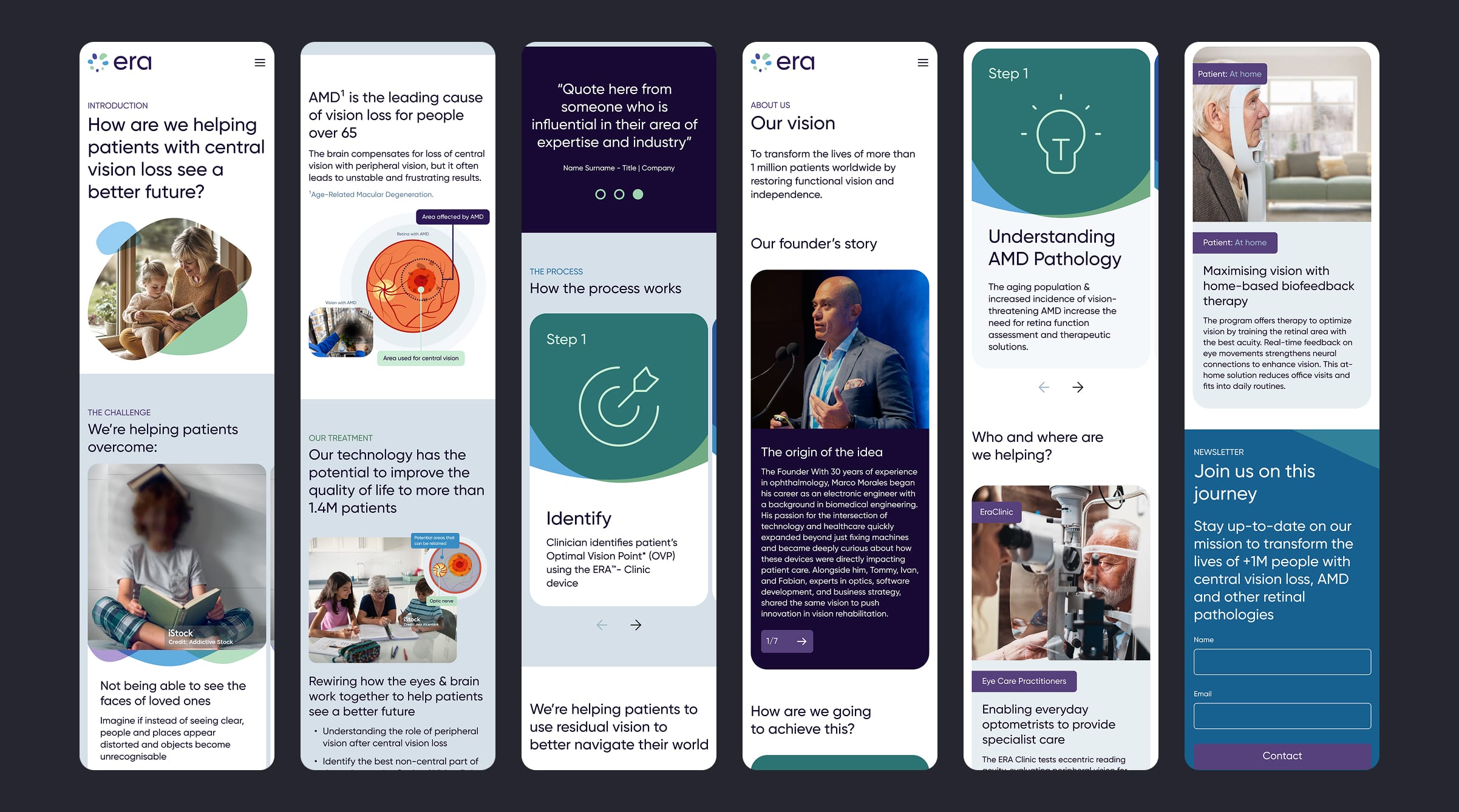
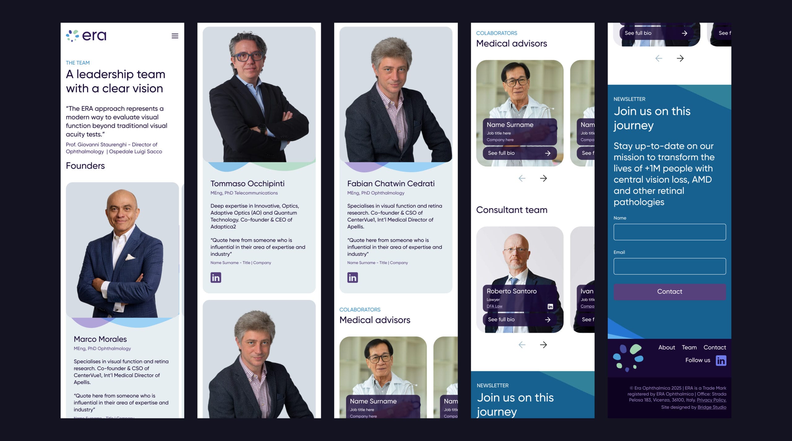
Desktop Version
Image is clickable
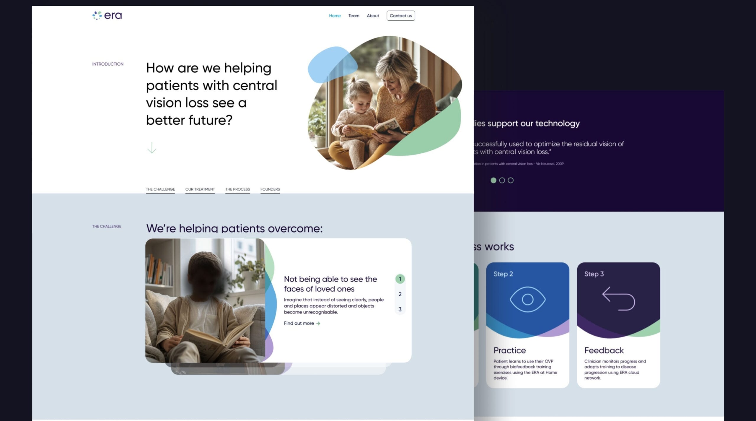
Challenge #1
Interface elements must maintain visual stability during usage to prevent jitter or shift. Specifically, color contrasts and font sizes create disorienting visual shifts when users attempt to read content, leading to missed instructions and task interruption.
Image is clickable
Challenge #2
Interface elements must reduce cognitive load during visual scanning to prevent users from requiring 5+ taps to understand interactive components.
Image is clickable
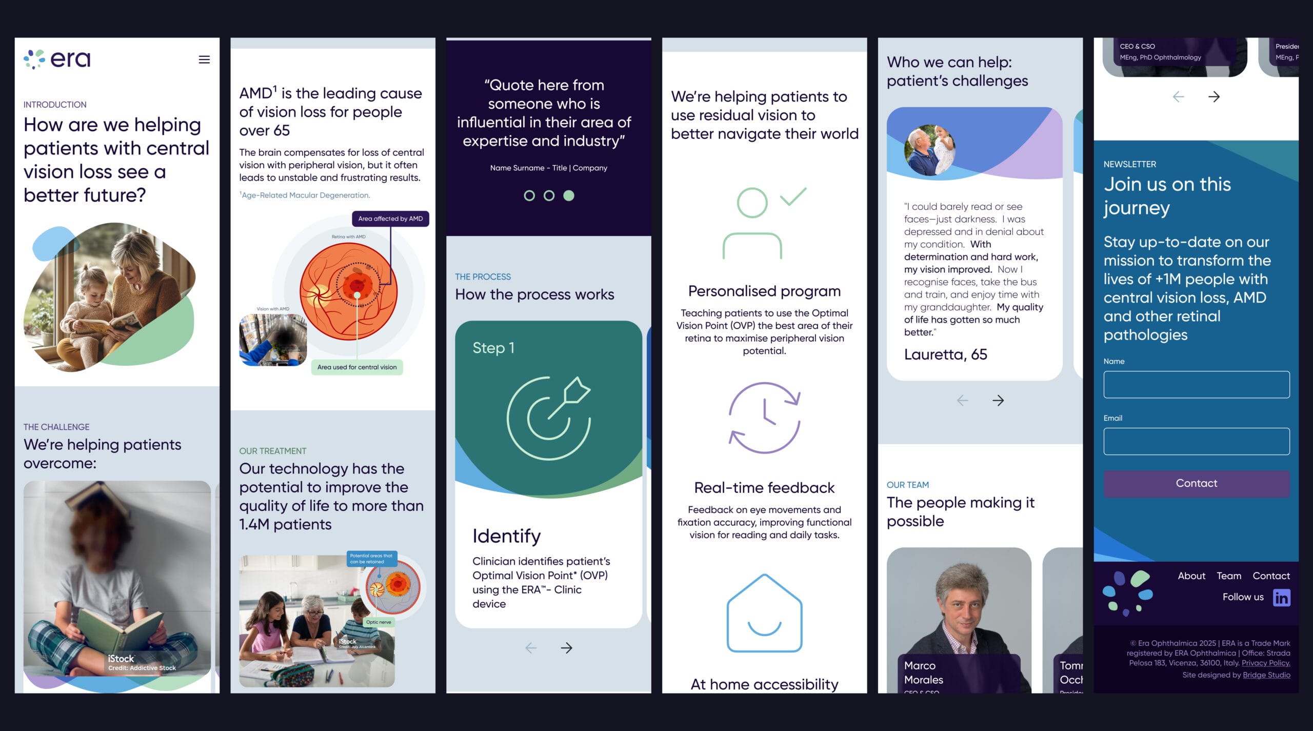
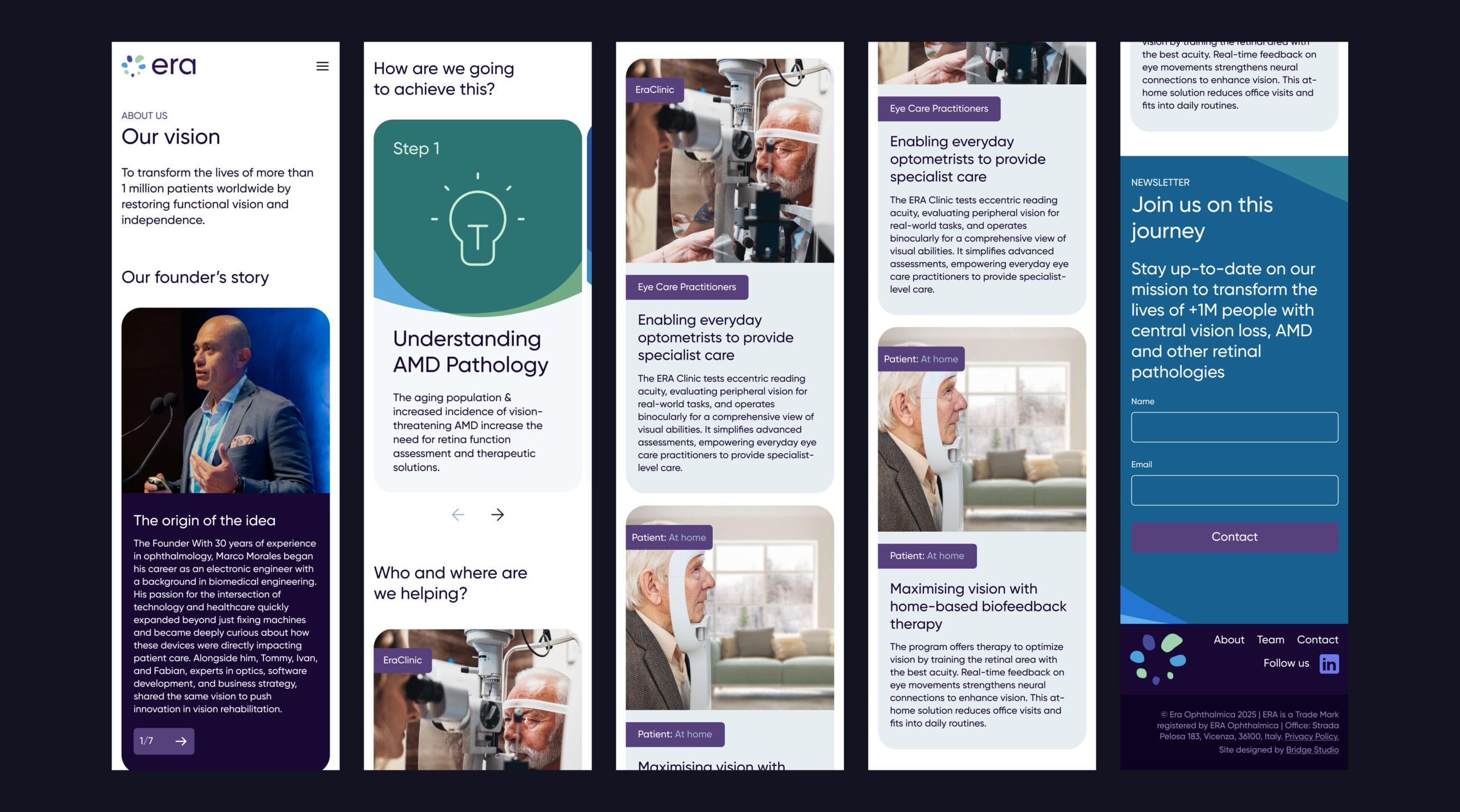
Additional designs
Image is clickable
Results
Users complete critical tasks without abandoning the site after 1 minute
Users require ≤2 taps to understand interactive components, reducing cognitive overload from 5+ taps to 2 taps average